Design wallpapers for any room

A wallpaper designer can imagine a large selection of this finishing material, because there are a huge number of these products on the sales market, and there are a lot of design options. It also has its own principles that are worth knowing.
Today we will tell you how to design wall murals depending on the premises. Also on the video and photo you will be presented with ready-made solutions that may be suitable in your case.
The content of the article
What to consider
When choosing a finish, you must first pay attention to the purpose of the room, its lighting, the height of the ceilings and the construction plan itself.
Let's take a closer look at these issues together:
- With a low ceiling - Suitable pattern with vertical stripes, visually increasing the height.
- For a small room - need a picture, with small and far scattered elements. A quick glance creates the illusion of magnification.
- In a narrow room - It is better to use strips located horizontally, or to divide the wall into two parts, using a panel (depending on how long the room is). The stripes are suitable for a not very long room, while the better it is lit, the more contrasting the picture.
- If the room is big - then the picture should be large, bright and complete.
- Rooms with various ledges, niches or arches - paste with wallpaper with a light pattern that does not hurt the eyes, on a lighter background, visually smoothing many elements.
- High ceilings - large drawing, bright. Background is selected any.
- Square room - the drawing looks large, the background is light.
- Small room - “expands” due to light tones. The drawing is small and rare.
- For a well-lit room - the picture needs a contrast, light and not very large, but not small. So choose designer drawings for your wallpaper according to this principle and you won’t be mistaken.
- Darkened room - requires soft tones, in such rooms warm colors look good, without sudden changes.
- Wallpaper with drawings (thematic) - used in the playroom, children's room, choosing the color, size and lighting are taken into account. In the kitchen - the picture is placed in accordance with the zone (brighter colors, in the dining table area, in the cooking zone - less bright, but combined with other zones).
- For sleeping - choose calm tones, soft transitions, airy drawings (unless of course some particular style is required that requires a different approach).
- In the office - maintain a working environment. Strict style, without ornate drawings, a variant of strict lines on a discreet background is possible.
- Guest room (or room) - not divided into zones. The drawing is the same on all walls, reflecting the lifestyle of the owners (the face of housing). The same goes for the lobby.
- In the hall - the picture is not catchy, warm tones, monotonous. Suitable geometry, or just a shallow strip. Tastes are always different. Someone prefers one, someone else a different style.
Attention: You always need to remember - not all styles are combined, or even fit one another in aesthetic terms. When choosing a picture, the overall style is taken into account.
- Transitions should be smooth and logical, ultimately - supporting a common style.You can experiment with a bedroom, this place is not put on display, and can radically differ in style, as much as you want.
- Choosing a style, drawing - you need to be guided primarily on the basis of their own feelings.
No need to try to surprise guests, they will come and go. Housing should be comfortable, and it can only be liked by its owners, but this is enough to make the lady want to return, and in her "nest" was comfortable and calm.
The following instructions on the types of premises will help you with the right choice. And the price will already depend on the volume and material of manufacture.
The choice of wallpaper in the premises by purpose and color
Although the trends in wallpaper design can change from year to year, but color is the basis of the interior. With it, it is possible to change the mood, affect well-being. Color combinations are a science. How to choose it for this or that room? Mankind has long known the answer to this not simple question.
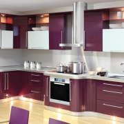
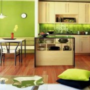
Wallpaper for the kitchen
Many spend time in the kitchen, much more than in other rooms. Above all, there, first of all, food is prepared, and of course, they eat there. And this means - the predominant color should promote appetite, cause positive emotions.
For example, not too catchy, for example - yellow, or calm - beige. Silver color, or blue, symbolizes water (humidity), and white - purity, very positive, favorable.

You should not use aggressive tones in such places, as far as possible - bright "spots" in the area of the dining table (for example, red). This color, it is believed, stimulates the appetite, but too much red can lead to unnecessary aggression, which is not desirable.

Also, using different colors or changing the texture of the wallpaper, you can zone the room. This is extremely important in a small kitchen or combined kitchen (seeWhat is the best wallpaper for the kitchen: make a choice).

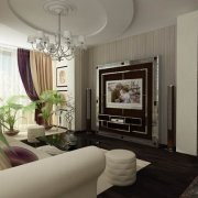
Hall, guest room, lobby
In such places, you need calm, it is assumed that the whole family is going here, guests are being received. A soothing, calm color is green, or light green.

Halftones are suitable, but one should not get carried away, one must not forget that this place is the face of all housing. In order to better understand the meaning of these zones, it’s enough to remember that the Newsletter (the priestesses of the goddess Vesta, the guardians of the hearth) were met and located in the lobby, hence the name - the lobby. And it is necessary - whether to remind that these priestesses were very respected and revered in Greece.

Cabinet
Work environment in the office (seeCabinet finishing: a non-standard approach), you need to support, and with the help of color, including. The productive work is well influenced by the blue, cold color. In such an area, halftones are not acceptable.

Strict style - emphasize cardinal contrasts, but you need to choose - carefully, taking into account the views of the one who will later use this room.

You can use a color and pattern that resembles a natural stone, for example - granite. The texture of the picture and color is determined by the sensations, but you need to remember - the seasoned style is always better. With aging, even after many years, the fashion has already passed, but the look remains.

For bedroom
Calm tones. Suitable colors - peach, flesh. The recreation area does not require aggression, but you can add a few "spots", more vivid. This will contribute to the tide on waking.
It is important to correctly determine the location of such "spots". They should be in sight, only at the time of wakefulness, at the same time, did not catch the eye when resting.

Attention: Such places do not suffer excesses, clutter, unnecessary jewelry. Color plays a very important role here, subconsciously, scrolling through the events of the past day, you need to get rid of excessive tension, do not excite the imagination with too bright colors.
 Bedroom in blue tones. | The recreation area should be comfortable. It depends on the person himself. For example, blue tones will calm and balance. |
 Green bedroom | The green color will help to remove irritation, it will also calm and give hope. |
 Red bedroom | This color can give confidence. For the bedroom, it is used with various combinations and makes unique drawings. |
 Black wallpaper in the bedroom interior | This color is very ambiguous. He gives mystery and mysticism to the room. With its use, it is better to be careful and combine it. |
 White bedroom | This is the color of freedom. It can be perfectly combined with any color. The pure white color does not always look good, you can also give it some shades. |
 Yellow tones in the decoration of the bedroom | This color looks great and can cheer you up. Perfect for small rooms, or which do not have good lighting. They are able to visually enlarge the room. |
The recreation area should be comfortable. It depends on the person himself. For example, blue tones will calm and balance. Everything you choose and you can do it yourself, just choose your direction.
Children
Immediately you need to make a reservation that when choosing a color, there is a difference. For boys - choose a more strict style, blue, or blue, for girls - pink, various shades.

It is necessary to avoid monotony in both cases. Usually, colors are “diluted” using shades, but this can also be achieved using transparency, using the effect of smooth transitions from tone to tone. If the room has a games area, you can highlight it with a brighter color.

In addition, each baby has its own preferences. This should not be neglected, even if it seems that it is too much. It is necessary to try to soften, to seek a compromise, the child, in this case, will feel involved in the decisions, and of course he should like it.

Sometimes, I don’t feel like boring rules. In this case, you can add “colorize” the primary color. But you need to do this so that the colors fit together (combined).

There are many opinions about which color is more suitable for a particular room. There are no strict rules, each person perceives any combination in his own way, has his own associations. And far from always, the generally accepted opinion on this subject coincides with the opinion of each of us.
Another thing is nature. There are all the answers, and by the way - you can see clearly. For example, a yellow apple, and a green leaf on it, or beet tops. So clearly, you can imagine any combination, and create your own unique style.
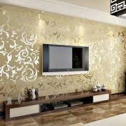
Alternatively, you can use 3D wallpapers, which is fashionable, and at the same time allows you to adhere to a certain style. You can use them in any room, it is important not to overdo it.

For example - in the nursery, you can allow fairy-tale heroes, but in the living room, it will be limited to small inserts. In the kitchen, colorful “spots” in the dining area. Do not glue such wallpaper in the hallway, out of place.

Wallpaper for the ceiling
Use vinyl or glass (seeFiberglass Wallpaper and Interior Applications) They can be cramped, structural, smooth. This is a relatively inexpensive way to finish, so it is in demand.

The classic color is white, but based on the general style, you can easily change it. Here, you can use both your ideas and take advantage of the ideas of designers.
Wallpaper for furniture
When choosing wallpaper for furniture, first of all you need to remember - that you can not combine cold tones with warm colors.

Walls and furniture should not be monophonic, but on the contrary, we must try to visually separate them. For example - brown furniture, it requires contrasting tones, but soft, warm, not aggressive.

Almost any color is suitable for light walls, provided the seasoned style - it always looks good. But if the furniture itself is colored, then the walls need a calm color.

Wallpaper for the interior
It is always easier to buy wallpaper for an already finished interior. Based on this, you need to calculate in advance the possible options. Possible decorations - paintings, photographs, mirrors, all this should fit seamlessly.

The color of windows, doors, various partitions, stairs also plays a role. It is worth spending time, walking around, imagining how it can be, what is needed, and what, it can simply be a tribute to fashion and not worth attention.

Decide on the color, style, and only then make a decision. Equipping your home, as with cooking, it is important to mood, in a hurry nothing good will come out. In this case, the wallpaper is the last thing that is selected based on the color and style of the interior.
Attention: At the same time, it is advisable to choose the interior for the lifestyle of the owners of the house, in this case, they will feel confident and comfortable in a familiar environment.
Curtains to wallpaper
The role of curtains should not be underestimated. Therefore, it is necessary to think over both style and color. They are selected based on the color of the wallpaper, but this topic is serious and requires separate consideration.

Attention: It is important to remember - this element of decor depends entirely on the general style, and is chosen based on this. You can do it yourself, but it is better to resort to the advice of a designer. In any case, the choice must be made after the walls and ceiling are ready.
The advice of psychologists and experts Feng Shui
The ancient Chinese teaching of feng shui. According to him, the dwelling is divided into zones, while objects belonging to one should not be in another zone.
In addition, the zones are divided according to the cardinal points, and their color according to the affiliation of the male and female principles (YIN, YANG). Needless to say, like any other doctrine, it requires careful study before it can be applied.

Attention: The opinion is quite justified that most of what is used with reference to Feng Shui is nothing but prejudice. The doctrine itself, of course, is not fiction, but it is a doctrine, it cannot be used in parts, it is necessary to live like this.
You can’t put the bed as it should, and expect a miracle, of course - nothing will happen. But life in Feng Shui, in the end, will lead to some results. Having decided to equip the house according to the doctrine, you need to fully comply with it, according to all the canons, otherwise what is the point? Everything else is just a tribute to fashion, and has no meaning, as well as relation to teaching.
From the point of view of psychology, the use of different color compositions affects a person differently, it has been known for a long time, and different peoples have their own opinions on this topic. You should not consider such things superficially, they deserve a more thorough study. Thoughtless use can lead to the opposite result, which is most likely not desirable.
It becomes clear that there is a significant difference of opinion on the application of the teaching.Having studied it superficially, many authors interpret it in their own way, missing the point, leaving only beautiful statements, which eventually turns into a fairy tale. It's a pity. The teaching is very wise, and its essence is not at all how to arrange furniture, or what color the walls should be.
How to choose wallpaper when buying
Design wallpapers also make different mechanisms and people. Everyone tends to make mistakes. Let's look at what to look for when buying.
- When choosing, you need to pay attention to which batch of rolls. Sometimes, it happens that the color is a little different, so this point is very important. For this reason, the wallpaper should be taken with a margin. After time, it’s simply impossible to find such a color, and the stock will come in handy. Whether it is a randomly damaged sheet during gluing, or after, during use, the walls often tear and get dirty (for example, if there are small children). Lot numbers are written on the labels of each roll, if in doubt, you can ask to unpack the selected roll, and check visually.
- Rolls should be packed in cellophane, this protects them from getting wet and drying out. Any violation of the integrity of the packaging is suspicious.
- The edges of each roll should not be cracked, this can be seen if you pay attention. In diameter, the roll should be round, caked wallpaper (flattened), it is not convenient to glue, which means that - the quality will suffer.
- Depending on the walls, preferences are made. For example: for not very even walls, vinyl is preferable. Due to the relief structure, it will hide irregularities. This kind can be used with even walls, but if there are slight irregularities, then this method is simple - not replaceable.
- It is better to make preliminary measurements to calculate the required number of wallpapers with the one who will perform the gluing work. And when buying, it is necessary to take into account that the fit of the picture will require a margin. This means that you need to take a little more than what happened in the calculations. Practice shows that it is very difficult to buy the missing amount of wallpaper, the color of different parties is different, you have to look at different stores, and not the fact that there is one. Information on how much allowance for a drawing is needed can be found on the packaging, for each drawing, a different allowance.
- In cases where a lot of wallpaper is not needed, for example - for pasting a small room (niche), you can ask the seller for the rest. Usually they are always available, and at the same time they are high-quality wallpapers, they are simply not in demand, due to the small balance. Such a "move" will save a little.
- In many stores, practice samplers. This is when you can take a small piece of wallpaper home in order to see how it looks in a room that you gently paste. In this case, it is possible to check the goods for quality. You can calmly, without fuss and embarrassment, arrange a "test". For rooms where humidity is supposed, or even spray (kitchen), you can wet or even rub a piece to understand how it will behave under certain conditions. You can test it for tearing, for the perception of grease stains, check whether it is washed off from it. In general - to experience.
Starting work of such a plan, it is important to prepare, carefully read the tips, we, in turn, having practical experience, knowledge - are always happy to share with our readers. Often, a person does not need, until a certain time, some knowledge, but having decided that there is almost impossible in life, you are probably right.
One has only to delve into, take advantage of experience, best practices, and everything turns out. Wallpaper for walls and design decisions may be different, but the principles will be the same.